Posts

Final Stretch

Image
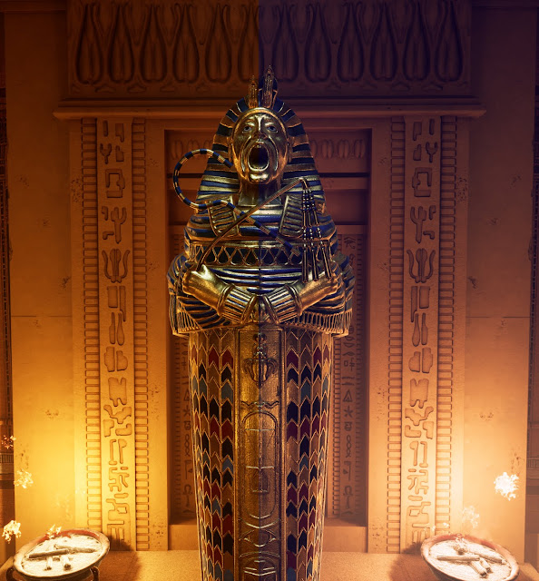
LUTs and Post Processing Creating the Look Up Table After getting the initial lighting, I wanted to experiment with colour grading. For this, I took a high definition screenshot of my centerpiece, and then took it to Photoshop where I added multiple filters and layers to enhance or change the look of the lighting in the background. I then Applied the filter layers to a neutral LUT image and exported the new LUT as a PNG and imported that into Unreal Engine.  Once the modified LUT was in engine, I changed some texture settings and then applied it to a post process volume in the 'colour grading' tab. This changed the entire environment's lighting to what I had in Photoshop. I wanted to take some of the orange out and and some more cold light which I feel like I was successful. It's not perfect at in my opinion, I feel like what I did wasn't really and enhancement, but more of a preference thing as I feel like some people could go either way, however, I pref

Composition and Lighting

Image
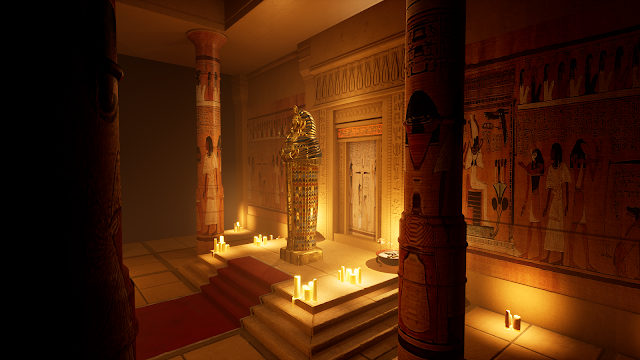
I now have everything in Unreal, and set up for the most part. I have detail normals for most of my assets for closeup detail and general lighting is in scene. I have height fog to create atmospheric fog along with a very low intensity directional light, but most of the lighting is coming from point lights at the candles and fire pits. I'm having quite a bit of trouble with my lighting. I've gotten to a point where I'm kinda satisfied but still feel like something isn't quite right. I feel like my main centerpiece isn't the most readable and I'm not sure whether that's to do with reflectivity, texturing or the lighting...maybe all three? I will keep trying to tweak with lights, and I will try adding a post process volume and adjusting value to get something I like.  This will allow me to create a LUT using Photoshop which might look really cool. For the pictures on the columns and wall, they're just images I found of Egyptian paintings online that

Platform and Floor

Image
Platform and Floor Floortile The platform is quite important, and will be the main stage of the environment that holds the centrepiece. I originally just had a tiling texture put onto it, but I wasn't happy with it after creating modular geometry for the floor, it seemed lacking or out of place, so I remodelled the high poly, roughing it up, adding edge damage and lots of imperfections, where I would take it to Substance Painter and apply textures to it that match the floor tiles I did. For textures, I just reused my sandstone basecolour and roughness. Platform

Texturing.Iron Maiden

Image
ID Masking Iron Maiden Before I could start texturing the sarcophagus, I said that I would go back to ZBrush and create an ID mask. For this, I just selected the decorative tool wrapped around the majority of it, and applied a polypaint colour. I also added so colour manually to a few areas, and for the headdress, I was lucky enough to already have a polygroup assigned to where I wanted the polypaint, so that was easy. In the future, I will try to be more careful to plan out ID masks slightly earlier on to save some time.  Once the ID mask was done, I exported it as a seperate FBX file, and went back to my previous Substance Painter file where I already had a baked mesh. I then deselected all of the bake maps other that ID map in the baking settings, to avoid overwritting my previous maps for no reason, and then selected my ID map FBX file, then baked. Afterwards I could then spend my time texturing how I wanted. Texturing Design This is what I went for. The'se

Into Unreal

Image
Getting Things Into Unreal Engine Now that I have 80% of my assets modelled, I should really start getting thing's set up in engine. To be completely honest, I should have done these at the very beginning. Once I had put my current assets in, I needed a couple of tiling textures to use for the large architectural pieces. I needed a sandstone wall texture, and a stone tile texture. For this, I created them in Substance Designer. I'm not going to pretend like I'm a texture artist, because I'm not. I followed two tutorials and changed some parameters around to get closer to what I needed. For the sandstone texture, I followed 'Daniel's Game Art' - DRY CEMENT in Substance Designer tutorial', and then tweaked the gradients to get the colour I wanted. I also messed around with the other parameters for noise etc. For the floor tiles texture, I followed 'Kaiyson's Substance Designer - Tiles Floor Material', and did a similar thing. Curre

Modelling The Architecture

Image
Architectural Elements For my architectural pieces, It will be made of stone, so after making the low and basic high poly models in Maya, I took the high poly model into ZBrush to add more detail. I would use arraymesh to duplicate the small square pieces. Once I have defined all of the shapes, I could then add noise to the mesh which gives the surface some texture to it, as if it was stone. This will also be complimented by the tileable stone material I will use for these parts.  I would create a small piece of broken stone out of a sphere. Apply noises to it to make it look like it's falling apart and flaking. I would then duplicate this around the mesh and use live booleans to cut it out of the original wall. This would make it look like there has been damage to the edges, etc. and that will be baked onto the low poly mesh in Substance Painter.  On the large surfaces of the mesh, I still wanted some light damage but adding the noise on it's on was too much, an

Centerpiece

Image
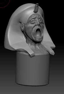
Modelling The Iron Maiden Shaping The Face Sculpting The Basics I started off with a rough blockout in Maya. This was literally just the most basic outline of the object I could get, that I could start pulling details out from using clay buildup brush, smooth, dam standard and hpolish. In the beginning I was a bit lost, but I ended up just going back to a 3D sphere in Zbrush for the head. This was the most time consuming part. Getting the shapes down. My most used brushes during this process was Clay buildup, smooth, hpolish and damstandard. Clay buildup was for the bulk of the shaping. Using this with the wacom tablet's pressure sensitivity to build geometry quickly, and dynameshing every so often when I add a large piece to keep topology constistant for sculpting. Smooth brush was also essential as the shap itself is very smooth, but for the sharper edges, I would use damstandard with hpolish to build up of down to the edge. This would create strong creases, but co